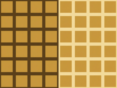
 Border Shift
Value Shift by Surround
An identical mid-tone tile reads as a luminous highlight when framed by dark umber neighbours, yet reads as a dark anchor inside a parchment cluster.
In a single photograph, colour gradients often flow smoothly across sky, skin, or water. The moment you divide a surface into discrete rectangular cells or geometric colour blocks, smooth atmosphere is replaced by hard edge-to-edge confrontation. Every cell border becomes an active threshold where two colours push against one another.
When photographers study painters and textile designers like Piet Mondrian, Anni Albers, or Paul Klee’s Bauhaus grid watercolours, one principle stands out: small high-intensity blocks hold their own against vast quiet fields only when their placement and surface area are calculated deliberately. In photography, we achieve colour-block coherence either inside a single frame (by framing intersecting architectural planes) or across a multi-frame assembly (by grouping photographs according to dominant hue and saturation).
Place a neutral warm-grey stone photograph beside a saturated terracotta wall frame, and the grey stone immediately takes on a cool greenish-slate cast. Place that exact same stone photograph beside a deep espresso shadow tile, and the stone jumps forward by two full stops of apparent brightness. Michel Eugène Chevreul documented this law of simultaneous contrast for the Gobelins tapestry works in 1839, and it governs every multi-image layout table today.
Border Shift
An identical mid-tone tile reads as a luminous highlight when framed by dark umber neighbours, yet reads as a dark anchor inside a parchment cluster.
 Area Extension
Luminous gold and parchment frames carry triple the optical weight of deep shadow frames; restrict bright accents to one-sixth or less of total grid area.
Whether you are sequencing nine frames for an exhibition wall or mapping four hundred tiles into a geometric mosaic, select one structural colour model and hold to it strictly:
| Structural Model | Area Allocation | Edge Behaviour | Studio Application |
|---|---|---|---|
| Tonal Monochrome + Single Warm Key | 85% Warm Neutral / 15% Ochre-Gold | Quiet tonal flow punctuated by deliberate rhythmic beats | Architectural typologies, street shadow grids, archival portraits |
| Split Earth & Parchment Polarity | 55% Deep Umber / 35% Mid Clay / 10% Cream | Strong figure-ground separation across large wall distances | High-legibility mosaics and bold geometric diptychs |
| Clustered Field Zoning | Contiguous 2×2 or 3×2 blocks of matching hue | Suppresses single-tile chatter; establishes broad colour rooms | Narrative sequences combining close detail with wide interiors |
The cleanest colour-block compositions start before the shutter fires. Photographers such as Franco Fontana and Ernst Haas demonstrated that telephoto compression and careful camera elevation can flatten three-dimensional landscapes or painted facades into interlocking rectangles of pure colour. When shooting specifically for a multi-frame assembly:
With your colour fields anchored, proceed to Crop Studies to control how frame boundaries cut through form.